By Matt Chisholm and Ross Cohen
matt(dash)hood(at)theory(dot)org and rcohen(plus)hood(at)snurgle(dot)org
 ...neighborhood.
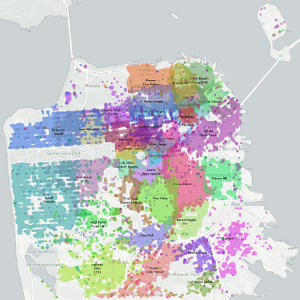
The Neighborhood Project is creating a map of city neighborhoods based on the collective opinions of internet users. Addresses and neighborhood data are translated into latitude and longitude values, and then drawn on the map. The address and neighborhood data are collected from housing posts on craigslist, and from people filling out the form below. The coordinates are generated using the free geocoder.us. The map is from Open Street Map. Our first city is San Francisco, but we will add more soon. Or you can download the software and make your own.
This is an experiment in collective knowledge. The more people who add their opinion to the database, the more accurate the neighborhood boundaries become.
The map is updated every night. We plan to make the data we've collected available, once we get a little bit better at working with PostgreSQL.
The algorithm for drawing neighborhoods is the "blobby" algorithm, well known in computer graphics. You can think of each point in a neighborhood as a little magnet, and the neighborhood is the region where the combined attraction of all those magnets is above a certain strength. A single point makes a small circle on the map. The influence of a number of nearby points will combine to make a curved blob. Read more about blobbies:
To prevent duplicate postings or submissions from combining to form larger and larger circles, the program discards duplicate entries when it draws the map.
There are two problems with the way the map is being drawn currently:
- Multiple entries that are very close together combine to form large blobs. We are experimenting with an algorithm which reduces the individual contribution of points as the number of points in that immediate region increases.
- There are a small number of posts that are very far outside the neighborhood that they claim to be in. (Currently there appears to be an Inner Sunset and a Marina post in SOMA, and a SOMA post in Potrero Hill, a USF/Panhandle post in the Sunset, and so on.) We may develop an algorithm that discards data points that are very divergent from the average or standard deviation for that neighborhood.
Thanks to Jeremy Avnet, Jonathan Moore, Amber Clisura, theory.org and mosuki.com for inspiration and support.
The software to create these maps is available on GitHub. It is licensed under the GNU GPL. It is written in Python and uses the PostgreSQL database. It's also hella beta so be afraid, be very afraid.